I'm reading Stephen Few's Information Dashboard Design, and he makes the most elegant points:
Reduce the non-data pixels:
- Eliminate all unnecessary non-data pixels
- De-emphasize and regularize the non-data pixels that remain
- Eliminate all unnecessary data pixels
- Highlight the most important data pixels that remain
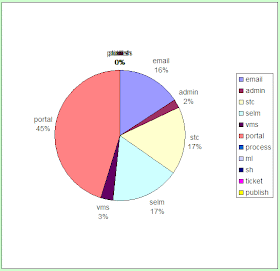
So I'm trying a little experiment on myself. I keep a time sheet in Excel so I can track where my time goes (plus I find that recording my activities makes me way more productive--try it some time). I've been keeping a little pie chart dashboard on the sheet so I can see how my time gets allocated. It seemed useful to me.
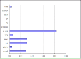
So as an experiment, I've added a bar chart of the same data.
Here is the pie:

Here is the bar:

Jury of one is out on this. What's your opinion?
As always, it depends. If you want to know at a glance which activities are taking up what proportion of your time, nothing beats the pie chart. If you want to compare and contrast among the activities, and if you want to track trends over time, go with the bar chart.
ReplyDeleteSometimes I feel like a slice of pie. Sometimes I want to stop at a bar.
Interesting that you should write this post, our current software release introduces Dashboards and Charts. As I test, I keep thinking about how I am going to present these new features in the online docs. It should be fun.
ReplyDeleteThis comment has been removed by the author.
ReplyDeleteBar.
ReplyDeleteI've never been able to make sense of slices. I keep mentally trying to compare the percentages. The bar puts things in context almost immediately.
But then, I am not in management, and am, therefore, not the target audience for executive dashboards.
Pretty much what Larry said, but in this case, bar definitely - in these situations I find them much easier for rough estimates of comparison (e.g. twice as much, ten times as much)
ReplyDeleteI've been using both for a week a now, and although I'm not ready to delete the pie chart from my template, I have moved the bar chart up so it is my primary graphic. The pie is superior if I want to compare one against the whole, as in, "Wow, the portal project is taking up a lot of my time." The bar is superior if I want to compare one against another. I've read that but it came home when I found myself wanting to add a bar that reflected the sum of all the projects.
ReplyDeleteMike,
ReplyDeleteYou can get the best of both worlds (pie + bar) by using stacked bar charts.
To quote Excel help, "This type of chart compares the percentage that each value contributes to a total across categories."
So, you could chart how 100% of your time is used over a period of time.
Your thoughts?
The stacked bar could be a good compromise. It is better (theoretically) than the pie because it is linear instead of relying just on area. It lacks the side by side ease of comparison. Like all compromises, it inherits good aspects of both, and bad aspects as well. I have since noticed that the more things I work on, the harder the pie is to interpret.
ReplyDelete